How Paint Colors Affect Your Mood and Home Ambiance
- Jenny Kakoudakis

- Dec 21, 2023
- 5 min read
Updated: Nov 30, 2024
The power of color in transforming spaces is often understated. When you walk into a room, the color of the walls is one of the first things that impacts your senses. It sets the tone, influences your mood, and alters your perception of space.
Understanding how different paint colors affect your mood and home ambiance is essential, whether you're embarking on a full home makeover or a simple refresh.
In this article, we delve into the psychology of colors, offering insights and solutions for creating a harmonious home environment.
In this article we explore
The Psychology of Color
Warm Colors: Energy and Comfort
Warm colors, such as red, orange, and yellow, are known to evoke feelings of warmth and comfort. These hues stimulate and energize, making them ideal for social spaces like living rooms and kitchens.
Red, in particular, can raise a room's energy level, while orange is often associated with enthusiasm and excitement.
However, it’s essential to balance these vibrant tones with neutral shades to avoid overwhelming the space. It also all starts with the color you choose for your front door.

Cool Colors: Calmness and Serenity
On the other end of the spectrum, cool colors like blue, green, and purple are synonymous with calmness and serenity.
Blue, known for its soothing properties, is perfect for bedrooms and bathrooms, where relaxation is key.
Green, reminiscent of nature, promotes comfort and tranquility, making it a great choice for almost any room. Here are the top 20 green colors of all time.
Purple, in its lighter shades, can bring a restful quality to a space, while darker hues entail luxury and creativity.

Impact on Room Size and Shape
Color can play a pivotal role in altering the perception of a room’s size and shape.
Using light colors to make a room feel bigger
Light paint colors are known to make a room appear more spacious for several reasons, primarily related to the way they interact with light and affect our perception of space. Here are some key factors:
Reflecting Light: Light-colored paints, especially whites and pastels, have higher light reflectance values (LRVs). This means they reflect more light rather than absorbing it. As a result, the room feels brighter and more open, creating an illusion of increased space.
Enhancing Natural Light: When sunlight or artificial light sources bounce off light-colored surfaces, they distribute more evenly throughout the room. This helps eliminate harsh shadows and dark corners, giving the impression of a larger and airier space.
Visual Continuity: Light paint colors create visual continuity by minimizing the contrast between walls and ceilings. When there's less contrast, the boundaries of the room become less defined, and this lack of visual interruption contributes to a sense of expansiveness.
Psychological Impact: Light colors evoke a sense of airiness and openness, influencing our psychological perception of space. Dark colors tend to absorb light and can make a room feel more enclosed, while lighter shades have the opposite effect, promoting a feeling of spaciousness and tranquility.
The power of dark color in transforming spaces
Dark paint colors can have a significant impact on a room, influencing its atmosphere, aesthetics, and overall mood. Here are some effects and considerations associated with using dark paint colors:
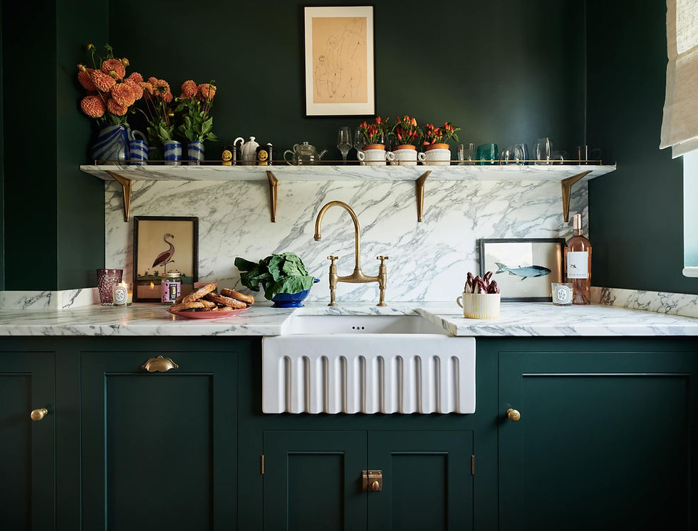
Intimacy and Coziness: Dark colors, such as deep blues, rich grays, or dark greens, can create a cozy and intimate atmosphere. These hues often evoke a sense of warmth and comfort, making larger rooms feel more inviting and smaller spaces feel snug.
Dramatic and Sophisticated Look: Dark paint colors add a level of drama and sophistication to a room. When used strategically, they can highlight architectural features, accentuate focal points, and create a visually striking backdrop for furniture and decor.

Using paint colors to create balance and harmony
The key to successful interior design lies in balance. Combining colors harmoniously can create a cohesive and inviting space. When choosing paint colors, consider the color wheel and principles of color harmony.
Complementary colors (those opposite each other on the color wheel) can create a dynamic look, while analogous colors (those next to each other) offer a more harmonious and subtle effect.
Seasonal influences
Seasonal changes can also influence your color choices. Lighter, brighter colors are often favored in spring and summer, bringing a fresh and airy feel to the home.
In contrast, autumn and winter may inspire the use of warmer, deeper tones, creating a cozy and snug ambiance.
How to personalizing your space with color
Your home is a reflection of your personality, so it's important to choose colors that resonate with you. Select colors that make you feel comfortable and happy, ensuring your home is a true personal sanctuary.
While trends can inspire, they should not dictate your choices. In recent years, home decoration has been hugely influenced by the 'color of the year' announced by different companies like Pantone and Dulux.
The Dulux Colour of the Year 2024 is Sweet Embrace, a light color that can work as a foundation to create uplifting color combinations.

The Cost Factor: A Practical Consideration
While exploring the impact of colors on mood, it's crucial to consider the interior house painting cost. Budgeting for a painting project involves balancing desired aesthetics with financial practicality.
The cost varies based on room size, paint quality, and the complexity of the job. Opting for high-quality paint can be cost-effective in the long run due to its durability and better coverage.
Understanding these cost factors ensures that your color transformation is not only emotionally satisfying but also financially manageable.
Enhancing Natural Light Through Color Choices
Incorporating paint colors to enhance natural light can significantly alter the ambiance of your home.
Lighter shades, particularly soft pastels and neutrals, can reflect natural light, making spaces appear brighter and more open. Conversely, darker hues can absorb light, creating a cozy, intimate feel in well-lit rooms.
This interplay between paint color and natural light not only affects visual perception but also influences the mood and energy of a space, making strategic color choices essential for rooms where daylight plays a key role.
Eco-Friendly Paint Choices
The trend towards sustainable living extends to paint selections, with more homeowners choosing low or zero VOC paints.
These environmentally friendly options enhance indoor air quality and are safer for households, particularly those with children or allergy-prone individuals.
Opting for eco-friendly paints aligns your home's ambiance with health and environmental consciousness.
How do I choose the right color for my rooms?
The color of paint you choose significantly influences your home's mood and ambiance. From creating a sense of space to impacting your emotional well-being, every hue has a role.
When strategically chosen and paired with complementary design elements, light colors can transform a room, making it feel larger and more inviting. On the other hand, with dark paint colors it's essential to strike a balance and consider the room's size, natural light, and the desired mood.
Balancing aesthetics, budget, natural light, and environmental considerations ensures a harmonious and healthy living environment.
Remember, the right color not only transforms walls but also reflects your personality and values, making your home a true sanctuary that resonates with your unique style and preferences.

Jenny Kakoudakis likes to blog about interiors. She launched award-winning Seasons in Colour in 2014. When she is not chasing criminals out of the financial system (her day job), she gets creative by redecorating her own home.
Download her free bathroom renovation guide here.


