Pantone’s 2025 Color of the Year “Cloud Dancer” Sparks Controversy in Design World
- Dec 29, 2025
- 5 min read
Updated: Jan 10
Every year, design professionals, marketers, artists, fashion houses, and trend forecasters around the world mark their calendars for one announcement: Pantone’s Color of the Year. It’s not just a paint choice — it’s a cultural statement. A predictive lens into what aesthetics, emotions, and values might define the coming year.
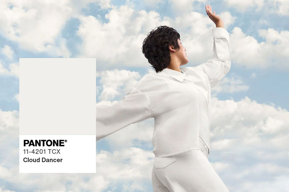
In 2025, Pantone selected a subdued, subtle shade called Cloud Dancer (PANTONE 11‑4201). It’s a barely‑there off‑white — quiet, muted, unobtrusive.
But far from being universally embraced, it’s become one of the most controversial Color of the Year picks in Pantone history.
In this post, we’ll explore:
What Cloud Dancer is — and isn’t
Why this choice sparked backlash
The cultural, psychological, and industry implications
Voices from designers, creatives, and critics
What this controversy reveals about trends, symbolism, and design in 2025
How brands are responding
And what this means for future Colors of the Year
Let’s begin.
What Is Cloud Dancer? A Look at Pantone’s 2025 Pick
Cloud Dancer is a soft, minimal white with a hint of coolness. Pantone describes it as evoking “peace, clarity, and mental space” — a retreat from digital noise and overstimulation.
But while Pantone's intent was serenity, many designers, artists, and social commentators felt... nothing. Before we talk about controversy, we have to understand the color itself.
A Neutral That Isn’t Bold
Cloud Dancer is a near‑white neutral, a shade with barely perceptible warmth or coolness — a soft, minimal tone that evokes light, calm, and a sense of blank space. It’s the color of freshly fallen snow in low light, or the faded silk of an old photograph.
Pantone described the choice as reflective of clarity, calm, and retreat — a counterpoint to the noise and chaos of modern life.
But unlike previous Color of the Year choices — which often made bold, expressive statements — Cloud Dancer is subtle to the point of being overlooked. And that subtlety is the root of much of the controversy.
Why Is Cloud Dancer So Controversial?
Here are the top reasons this Pantone 2025 Color of the Year choice has backfired for many creatives:
1. It's a "Non-Color" Lacking Emotion
One of the strongest points of criticism is philosophical:
“It’s not a color — it’s the absence of one.”
Designers and artists argue that Cloud Dancer doesn’t say much. In a world saturated with digital noise and constant visual input, critics expected a color that reacts to the times — something bold, emotive, and expressive.
Instead, what they got was nearly white — a shade that many feel could be described as “no color at all.”
This perception fuels a key part of the backlash: that the Color of the Year should communicate something, not fade into the background.
2. It Feels Tone-Deaf in Times of Crisis
The mid‑2020s have been a period of profound global upheaval — economically, politically, socially, and environmentally.
Many observers felt that Pantone missed an opportunity to choose a color that reflects:
Urgency around climate change
Political or social movements
Cultural diversity and representation
Emotional resilience
When many are calling for visibility, engagement, and boldness, Cloud Dancer was interpreted by some as a retreat — a call for quiet when louder colors might be more meaningful.
And that felt tone‑deaf to a design community tuned into global challenges.
3. Centering White in a Time of Diversity
Design professionals raised questions about cultural symbolism. Was choosing an almost-white color a missed opportunity to highlight more inclusive, expressive, or globally representative tones?
This criticism touches on broader issues about representation in design trends, and whose aesthetic values are being centered.
This point isn’t about race, but about symbolism and design inclusivity.
Colors like Viva Magenta, Classic Blue, or Living Coral (2019) carried cultural weight — they conveyed strength, optimism, and vitality.
Cloud Dancer, as an off‑white neutral, became unintentionally symbolic — and not everyone received that symbolism positively.
Some critics raised questions like:
Does centering an almost‑white tone signal design exclusivity?
Who does this represent in a global context?
Are we elevating aesthetics tied to a narrow design canon?
These are complex discussions — not about color alone, but what color choices mean in cultural context.
Perceptions of Marketing Over Meaning
Another thread in the controversy is skepticism about Pantone’s motivation.
Instead of introducing a new, unique hue, Pantone selected a shade already present in its catalog (PANTONE 11‑4201). This led some to suggest the choice was less about cultural insight and more about marketing simplicity or safety.
Designers quipped:
“It feels like a paint chip named ‘neutral beige’ got a marketing makeover.”
When experts demand visionary thinking from a global trend authority, choosing a safe, familiar shade felt like a missed opportunity.
Emotional and Psychological Impact
Colors elicit deep emotional responses — that’s why color psychology matters in branding, product design, and user experience.
But Cloud Dancer’s emotional register is so subdued that many feel it doesn’t register at all.
Where other Colors of the Year brought feelings of confidence, energy, or reassurance, this one left some asking:
“What emotion should this color evoke?”
When designers struggle to assign meaningful emotional impact to a Color of the Year, controversy almost inevitably follows.
What the Color of the Year Is Supposed to Do
To grasp why Cloud Dancer provoked such a wide‑ranging reaction, we need to understand the role and influence of the Pantone Color of the Year.
Since 2000, Pantone has selected a color annually to reflect global mood, cultural trends, and socio‑economic climates. It isn’t just about what looks good — it’s about what color resonates with the moment we’re living in.
Historically, Colors of the Year have:
Represented Emotional Zeitgeist
Classic Blue (2020) — evoked stability and confidence at the start of a turbulent decade.
Viva Magenta (2023) — bold, expressive, vibrant — a color of empowerment.
Influenced Design and Culture
Film, fashion, branding, tech interfaces, product design, interior spaces — all have incorporated the selected color into their palettes.
Forecasted Trends
Businesses use the Color of the Year for product development, packaging redesigns, and marketing campaigns.
It’s a cultural barometer — and people expect it to have meaning. So when Pantone chose a shade that many saw as neutral to a fault, the response was swift.
What This Controversy Says About Design in 2025
The Cloud Dancer backlash highlights a bigger issue: what we expect from the Color of the Year. It’s not just a shade — it’s a story, a symbol, and a statement.
Should color calm us or challenge us? Should it reflect our current climate or offer an aspirational escape? Cloud Dancer has unintentionally opened the floor for these deeper questions — and perhaps, that’s its true impact.
Final Thoughts: Is Cloud Dancer a Mistake — or a Masterpiece?
Whether you see Cloud Dancer as visionary minimalism or as a design industry misstep, there's no denying its power to stir conversation. And in a world where visual silence can be just as loud as color, maybe that’s the point.
Tell Us: How Do You Feel About Pantone’s Cloud Dancer?
Do you love its calm elegance or loathe its neutrality?
Does this color reflect 2025 — or avoid it?
Drop your thoughts below. And don’t forget to share this post with your fellow creatives!
Our writers like to find the latest trends in home decor. We launched the award-winning Seasons in Colour in 2015 and the luxury property and interior decor blog www.alltheprettyhomes.com in 2024 to cover all your interior design, travel and lifestyle inspiration needs.


