5 top tips for working with neutrals
- Jenny Kakoudakis

- Apr 23, 2018
- 3 min read
Updated: Nov 22, 2024
In the context of interior design and colour theory, beige is one of the neutrals, together with ivory, taupe, black, grey and shades of white.
Called neutral for their lack of colour, they are great for layering and for creating a harmonious and calming decor in homes.
If you are looking to decorate your home in a way that does not overwhelm, using neutral colours and layering them is an excellent way to create flow between rooms and add a contemporary edge to your space.
We asked the team at interiors design studio Sims Hilditch to share their top tips for working with neutrals. Here's what they had to say:
If using the words 'neutrals' or ‘beige’ is off-putting, there are better ways of describing the colour which are way more appealing: latte, coffee, almond, raffia... all these tones can be layered to create something rich and interesting. Read on to find some of our top tips for working with a Neutral colour scheme.

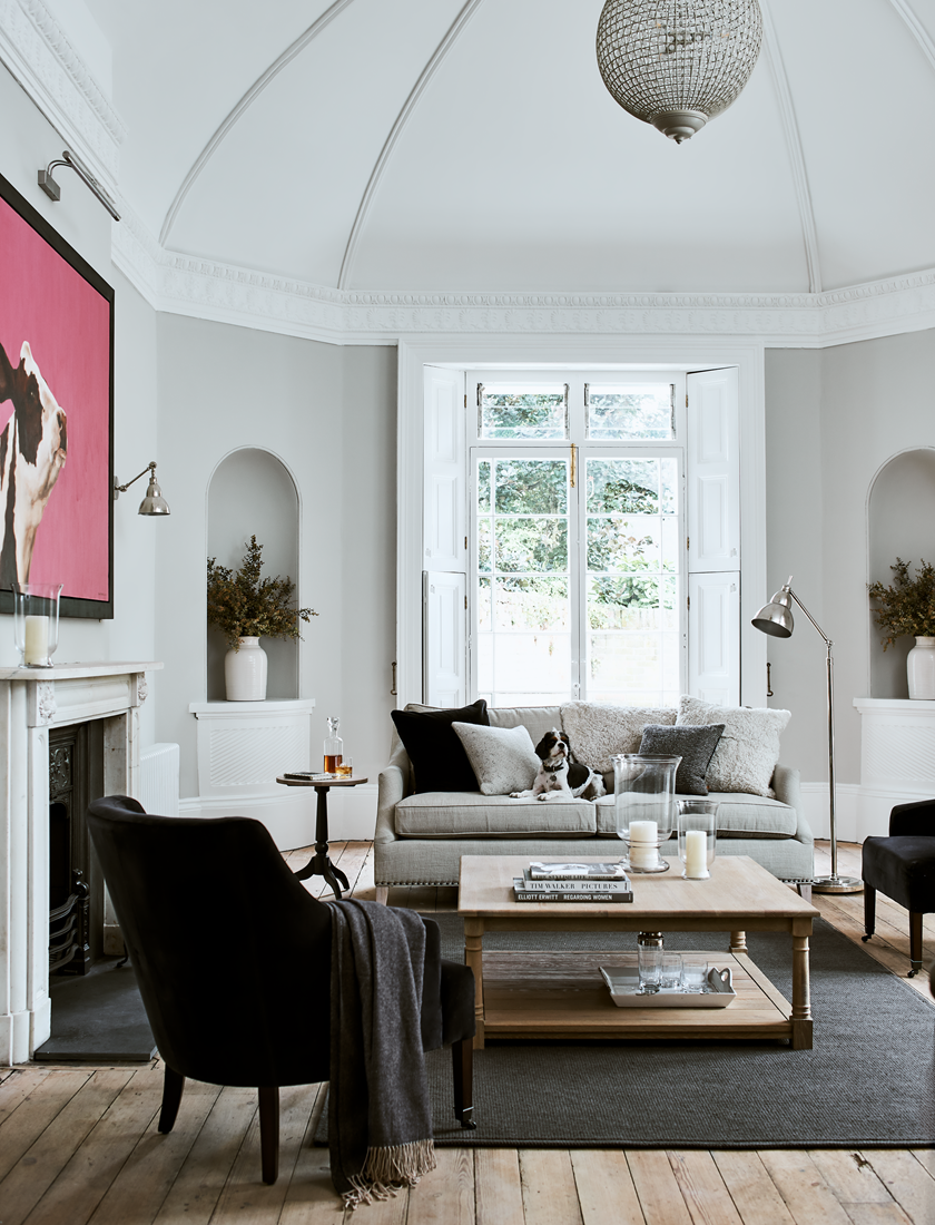
An inviting living room with lots of layering and cushions.

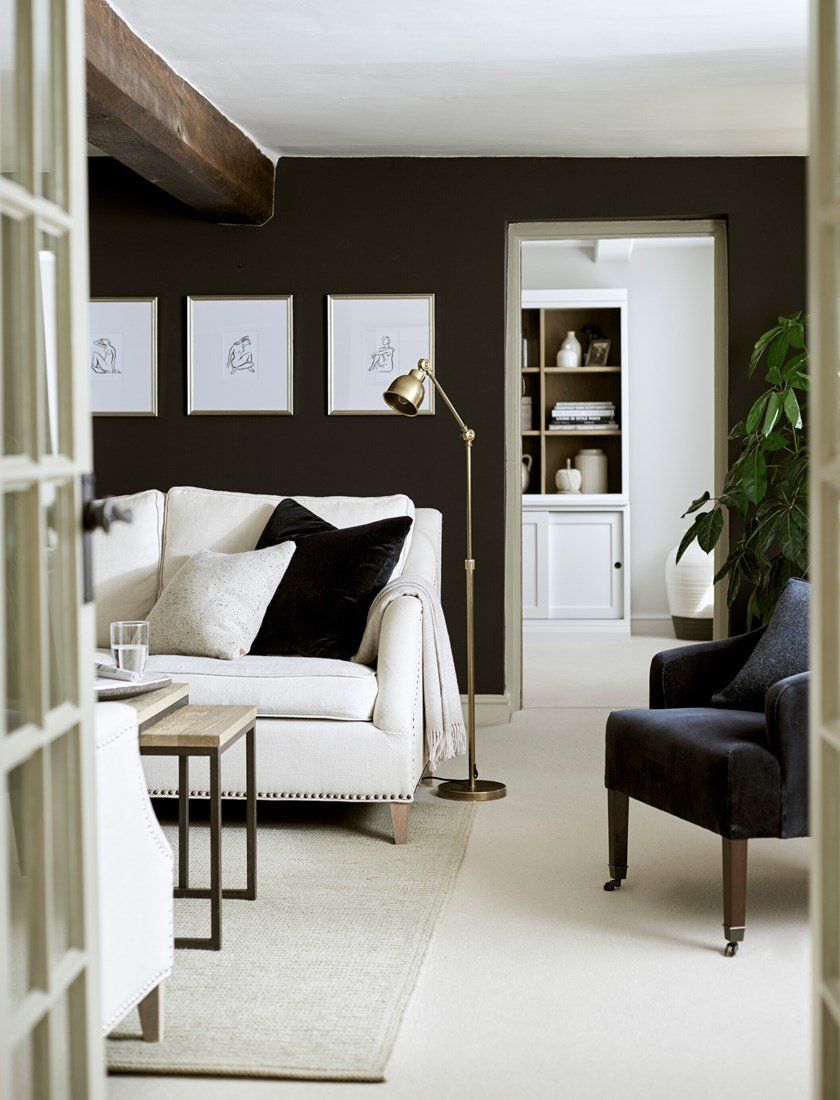
Black and white interior decor looks sophisticated in this setting.
5 top tips for working with neutrals, by Sims Hilditch
1. Architectural details
Always start by looking at the interior architecture: we often use beautiful natural materials like limestone, white washed oak and marble that have an innate sense of quality and a richness which creates the canvas for the furniture and decoration.
2. Add soft elements of colour for sophistication
When using neutral colours, it’s so important to have a few elements of colour which really enrich the room so the result is cohesive, sophisticated and restful.
3. Pair with natural textures
Soft neutral colours should be paired with natural textures such as velvets and silks to create layers of luxury and comfort throughout. Monochrome interiors are timeless, sophisticated and are a staple of the brand.
4. Layer fabrics
Natural fabrics should also be considered and are in a league of their own in this regard. From the cosiness of wool to the depth of woven linens and the light-loving qualities of velvet and silk, this is where a home’s character is defined.
When working with a neutral colour palette, layering different fabrics makes all the difference in bringing the room to life.

5. Combine with bold colours for drama
This is not to say that there is no place for bold colour like splashes of reds, oranges or even bright green. Keep bolder colour to accessories or plants, which can be easily updated as yours tastes change or if you want to refresh your look.
Neutral colors can make a space feel bigger
Neutral colors can make a space feel bigger by creating an illusion of openness and expansiveness. When walls, ceilings, and furnishings are painted in soft shades of beige, gray, or white, they reflect light more effectively, which can enhance the overall brightness of the room. This brightness can trick the eye into perceiving the space as larger than it actually is.
Moreover, neutral colors tend to recede visually, allowing for a seamless flow between different areas of a room. By minimizing harsh contrasts and bold patterns, these colors encourage a more cohesive and harmonious environment.
Additionally, using neutral tones can provide a versatile backdrop that allows for the incorporation of various decorative elements and textures, further contributing to the perception of space. For instance, when furniture and decor are kept in similar muted tones, the overall aesthetic feels less cluttered and more airy, making it easier for occupants to navigate and enjoy the area.
Thus, opting for neutral colors is a strategic choice in interior design that can effectively enhance the spatial dynamics of any room.
Neutral Decor examples


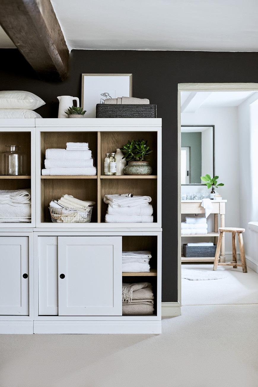


Above: the Suffolk wine rack and bookcase by Neptune Home.


So what do you think? Are you a fan of neutrals ? Is this calming palette 'speaking' to you? Would you layer greys and beiges or add some bold splashes of colour as well?
All photography courtesy of Sims Hilditch and Neptune Home.

Jenny Kakoudakis likes to blog about interiors. She launched award-winning Seasons in Colour in 2014. When she is not chasing criminals out of the financial system (her day job), she gets creative by redecorating her own home.
Download her free bathroom renovation guide here.


