Is green here to stay?
- Oct 31, 2016
- 4 min read
Move along grey here comes green. Said nobody, ever. Or did they? Green was Pantone's colour of the year in 2013 (in its emerald hue) and it is a colour that influences hotels of the moment and is strong in accessories, paint and wallpaper. Today I am looking at greens that are less "enchanted forest" and more "mystery lake" meaning moody green blues or green greys (because, simply put, grey is still big in our lives and we cannot just banish it).
The psychology of green colour
I covered the psychology behind green in a previous post (you can read about it here) but let's do a little repeat. Green is a very relaxing colour for the eye. In fact, green is the colour our eyes are most used to. It communicates peace, a safe place to be. Mixing it with soft pastels is ideal when you're talking about the moody greens.

Which green hues to use right now?
Having seen what goes into the magazines and the latest paint collections, I would say that the greens of the moment are less saturated and more 'moody'. Less intensity and more of a weathered/ faded look. Pastel versions of this colour also work well.


Left to right: Pearl Colour, Pearl Colour Dark, Aquamarine, all by Little Green available here.


Left to right: Pale Powder, Dix Blue, Green Blue, all Farrow & Ball available here. I know Pale Powder and Pearl Colour look a lot like each other but they are not the same colour. Pearl Colour is a grey variant whereas Pale Powder is an aqua shade.
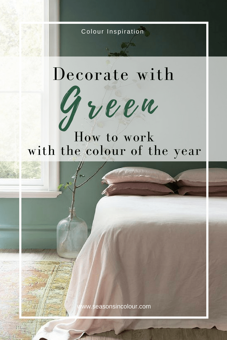
Green in the Bedroom
In this photo, from Australian company Cultiver, the green wall provides a perfect backdrop for pastel pink linen bed sheets. Note that the woodwork has also been painted in this example.

Photo credit: Cultiver

The photo above was my inspiration for a bedroom makeover in my own home this year (August 2016). It is from Hotel Bachaumont and you can see more about this amazing Art Deco inspired hotel here.
After finding the perfect bed in rose herringbone fabric from DFS, I set out to find the perfect green-blue shade for the wall behind the bed and here's my mood-board. To see the whole makeover, click here.

Photo credit: Seasons in Colour
So here's how my makeover ended up. The wall behind the bed is in Dix Blue by Farrow & Ball which goes so well with the dusky rose headboard (bed by DFS). I have also combined this colour with pink linen (from Soak and Sleep, available here)

Photo credit: Seasons in Colour
Dix Blue works so well as a pastel colour with brass accessories. In this close up, the brass wall light is from Rough Luck Studio in New York. I found them through ETSY.

Photo credit: Seasons in Colour
Because green is so relaxing, it is no wonder it is used so much in bedrooms. Below, this bedroom designed by Kim Daenen has a theme wall in Cachemire ‘Vert Olivier’ by Mathys.

Photo credit: Stephanie Duval
Look how beautifully the colour works with wooden accessories and the light leather handles on the wardrobes.

Photo credit: Stephanie Duval
Dining rooms
Interior designer Roxanne Stevens renovated a historical townhouse in the center of Antwerp and turned it into a bed & breakfast. What looks like an original little detail in the design of her B&B, actually originated as a practical solution to a problem Roxanne faced:
"When I took over this house with my, we had a bit of an issue with moisture in this particular wall. We ended up having to repaint the space, but a good friend of mine suggested I only paint over the area that needed it, and give a creative twist to it!"

Photo credit: Stephanie Duval
Living room
A living room gets a cool light green treatment in this Swedish flat and the result is a fresh, contemporary looking Scandi home. And because you cannot have a Scandi home without the necessary plants and hardwood floors... Not that the gallery wall is bad looking.
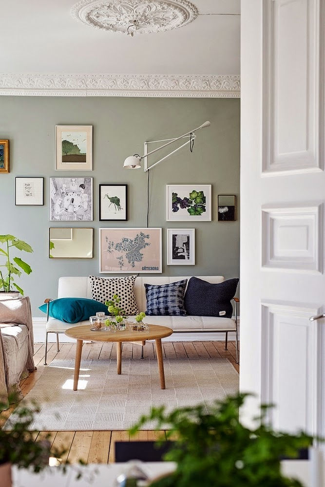
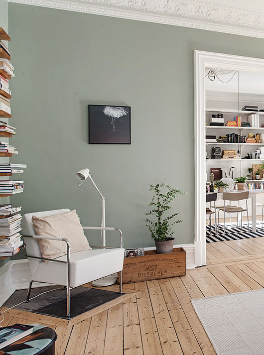
Photography courtesy of Alvhem.com
For a similar colour try Pale Powder by Farrow & Ball (below). This is actually the most popular of F&B's shades of aqua. It has an unparalleled softness and in north facing rooms can read almost as a delicate grey, but it is rarely cold due to the inclusion of green pigment. It is a great favourite for use in pretty attic bedrooms where it can be used on both ceiling and walls.

Photography courtesy of Farrow & Ball
If you want a weathered shade of smoky green that channels the traditional aesthetic of the English countryside, with an elevated tint then look no further than Farrow & Ball's Green Smoke (below). It is a shade much used in the late 19th Century which gets its name from the nature of its uncertain smokey green blue colour.

Kitchen
In the kitchen you have the option of painting your walls or going for cabinetry in green colours. Below is the light and spacious deVOL Air Kitchen in pistachio. Although used here over polished cement, this colour would look good over natural wood.


Photo credit: deVOL kitchens
This colour is something I learned to love as well given the current house we live in has LOTS of it in the kitchen (below) which is the only room I am not touching as yet as it will need some major reno-cash.
The Shaker style cabinets look really good in the colour. But the handles need changing and I am NOT liking the worktop not the busy tiles in the back.

Photo credit: Seasons in Colour
Bathroom
Let's not forget the bathrooms. Here, green can work well with a number of other colours and materials - wooden floors (cosy and country feel), white tiles (for a fresh look), brass accessories (the combination to go for) and for those who are bold and can find them: black taps!
The bathroom below, designed by Fusion D, belongs to a renovated flat in Bordeaux, France. Keeping with the character and age of the property, the designer added certain elements like the classic wash basin, the metro tiles, the free standing bath (painted in the same colour as the walls) and the round curtain rail.
The reclaimed wooden floors in herringbone pattern warm up the space.

Photo credit: Fusion D
If you liked this post you may also enjoy this one - splashes of green colour in this designer home! Click on the photo to open it.


